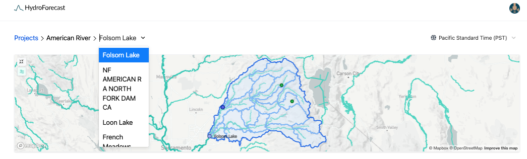
Navigating the dashboard
HydroForecast's web dashboard consists of one or more projects. When you first sign in, you'll see a list of your organization's projects. After selecting a project, you'll be able to see the forecasts for that region. The top section is comprised of a map showing the forecast locations for the project, along with their respective catchment areas and sub-basins. You can select a forecast location by clicking the map or by using the dropdown menu, as shown below:
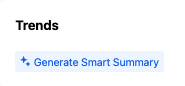
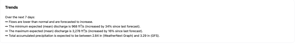
Above the short-term flow forecast section you can generate a smart summary. This summary will give an overview of how current flows compare to the long-term average ('normal') and some details about the current forecast and precipitation.
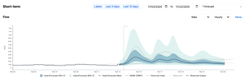
The next section shows the HydroForecast Short-term flow forecast followed by the temperature and precipitation forecasts. The menu offers controls to select which forecasts to display. Along with the mean forecast, confidence intervals are also provided to let customers decide which forecast to use based on their internal level of risk tolerance. Under normal circumstances, we also recommend the mean forecast. If, for example, there is a high deviation between the input weather forecasts, a different confidence interval may be more appropriate. Read more about our confidence intervals and how to use them here.
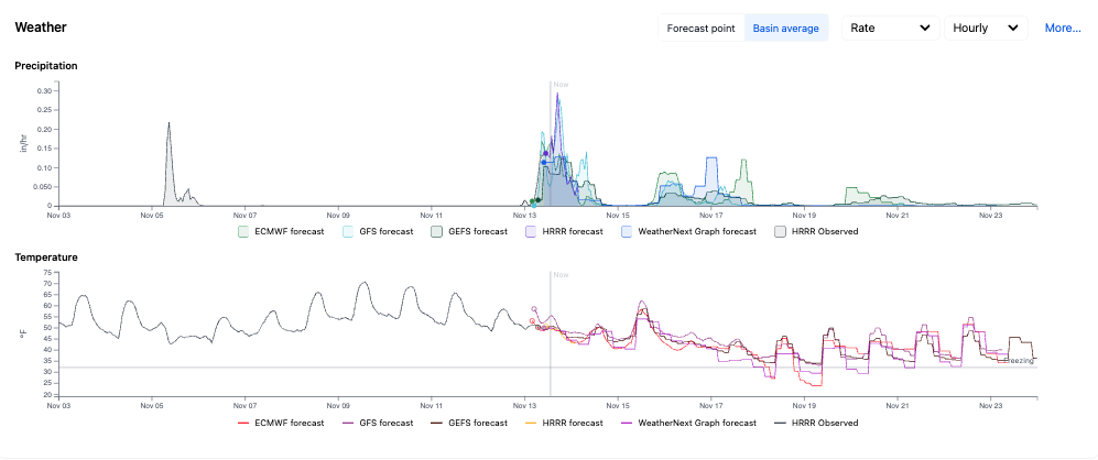
Uncertainty in model outputs is largely driven by variation in the input weather forecasts. For this reason, we provide all of the meteorological forecasts used as inputs into the model as well. These are visualized in the dashboard just under the short-term inflow forecast. The plots default to showing the weather at the forecast point. To adjust this view for a more comprehensive understanding of the local weather, click on Basin average to see the weather averaged across the basin, as shown in the plot below.
For locations with a seasonal forecast, there is an additional set of plots that illustrate the seasonal flow distributions and seasonal weather forecasts.
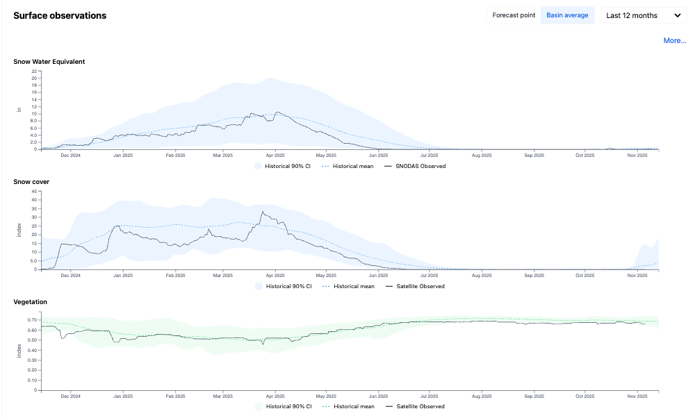
Scroll down to the Surface Observations section to view historic and near real-time satellite observations from selected model inputs. These plots show SNODAS Snow Water Equivalent, MODIS snow cover and the MODIS NDVI vegetation index. The blue band illustrates the historic percentile range with the historic mean in the blue dashed line. The black line denotes the observed values over the last 12-months, up until the current date. Toggle between viewing surface observations by water year, year-to-date, and viewing the full historical archive.
Visualizing land surface observations in near real-time can offer a lens into the basin's current conditions, e.g. as snow melts and vegetation builds up, rain or snow will infiltrate and/or runoff accordingly. The model sees these patterns and learns to interpret the hydrologic processes that are specific to each basin.